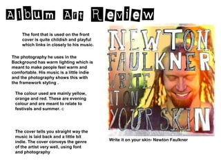
1. The font that is used on the front
cover is quite childish and playful
which links in closely to his music.
The photography he uses in the
Background has warm lighting which is
meant to make people feel warm and
comfortable. His music is a little indie
and the photography shows this with
the framework styling .
The colour used are mainly yellow,
orange and red. These are evening
colour and are meant to relate to
festivals and summer. c
The cover tells you straight way the
music is laid back and a little bit
indie. The cover conveys the genre Write it on your skin- Newton Faulkner
of the artist very well, using font
and photography
2. The font that is used on the front
cover is link closely to the album
name. It uses a neon sign like one
that would be placed outside a
hotel.
The photography that is used on the
album cover is one that’s linked with
the cover again. It makes you think that
the image is the “Hotel California”. The
effects used on this photo is a high
exposure, grainy and old fashioned.
The colour used are dark and
slightly faded and a warm filter on
the photo.
The cover doesn’t tell you anything Hotel California- The Eagles
about the music. But it’s relevant
to the age and time the music was
made.
3. The font that is used on the front
cover is 3D and bold that show that
it’s male group. It’s a bit quirky like
their music.
The image used is futuristic and relates
to some song in the album like “Mars”
and “Jupiter”. The space theme is
carried out through the whole album.
The way the images are arranged give a
sense on perceptive to the cover and a
depth of field.
The colours used in the cover are
merky blues and purples, once again
linking into the space theme. However
the name is in bright yellow to make it
stand out to the customers.
The cover doesn’t tell you much
about the music. The genre of the
music is soft rock and you don’t
get that vibe from the cover image.